Blume
Forging Quiet Luxury For A New Maternity Brand
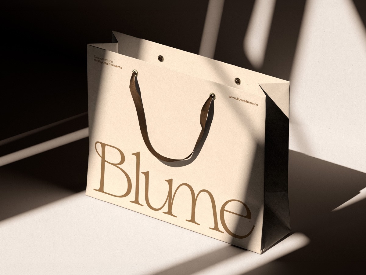
Blume is a maternity and motherhood brand built on warmth, care, and quiet sophistication. Launching into Hong Kong's baby product market with its debut silicone feeding kit, Blume needed an identity that could sit on a shelf next to premium skincare — not compete with the loud, primary-colour language most baby brands default to.
Year
2025
Sector
Maternity Product
Service
Branding / Corporate Identity / Website / Media Production
Team
Brandon Yeo
Jeerawat Ngammuangpak


Scope of Work
Logo & Lockups
We built Blume's logotype around soft curves and gentle proportions — approachable, but never losing its premium edge. The lowercase "b" was sculpted with fuller, nurturing curves that quietly echo the silhouette of pregnancy, while the connection between the u and m mirrors the intimacy of the mother-child bond. A monochromatic monogram rounds out the lockup system.
Brand Voice & Tone
We built Blume's logotype around soft curves and gentle proportions — approachable, but never losing its premium edge. The lowercase "b" was sculpted with fuller, nurturing curves that quietly echo the silhouette of pregnancy, while the connection between the u and m mirrors the intimacy of the mother-child bond. A monochromatic monogram rounds out the lockup system.
Product Photography
We built Blume's logotype around soft curves and gentle proportions — approachable, but never losing its premium edge. The lowercase "b" was sculpted with fuller, nurturing curves that quietly echo the silhouette of pregnancy, while the connection between the u and m mirrors the intimacy of the mother-child bond. A monochromatic monogram rounds out the lockup system.
Landing Pages & Microsites
We built Blume's logotype around soft curves and gentle proportions — approachable, but never losing its premium edge. The lowercase "b" was sculpted with fuller, nurturing curves that quietly echo the silhouette of pregnancy, while the connection between the u and m mirrors the intimacy of the mother-child bond. A monochromatic monogram rounds out the lockup system.
Solution
Rather than compete on the bright, primary-colour shelf most maternity brands crowd into, we gave Blume a visual language closer to fine skincare or heritage homeware — warm, restrained, and tactile.
Every element, from the logotype's pregnancy-echoing curve to the embossed packaging to the unposed photography, was built to make one promise feel true: this is a brand that treats early motherhood with the same care it treats its product design.


Share:
